In a rush? Check out the prototype.
👀 Overview
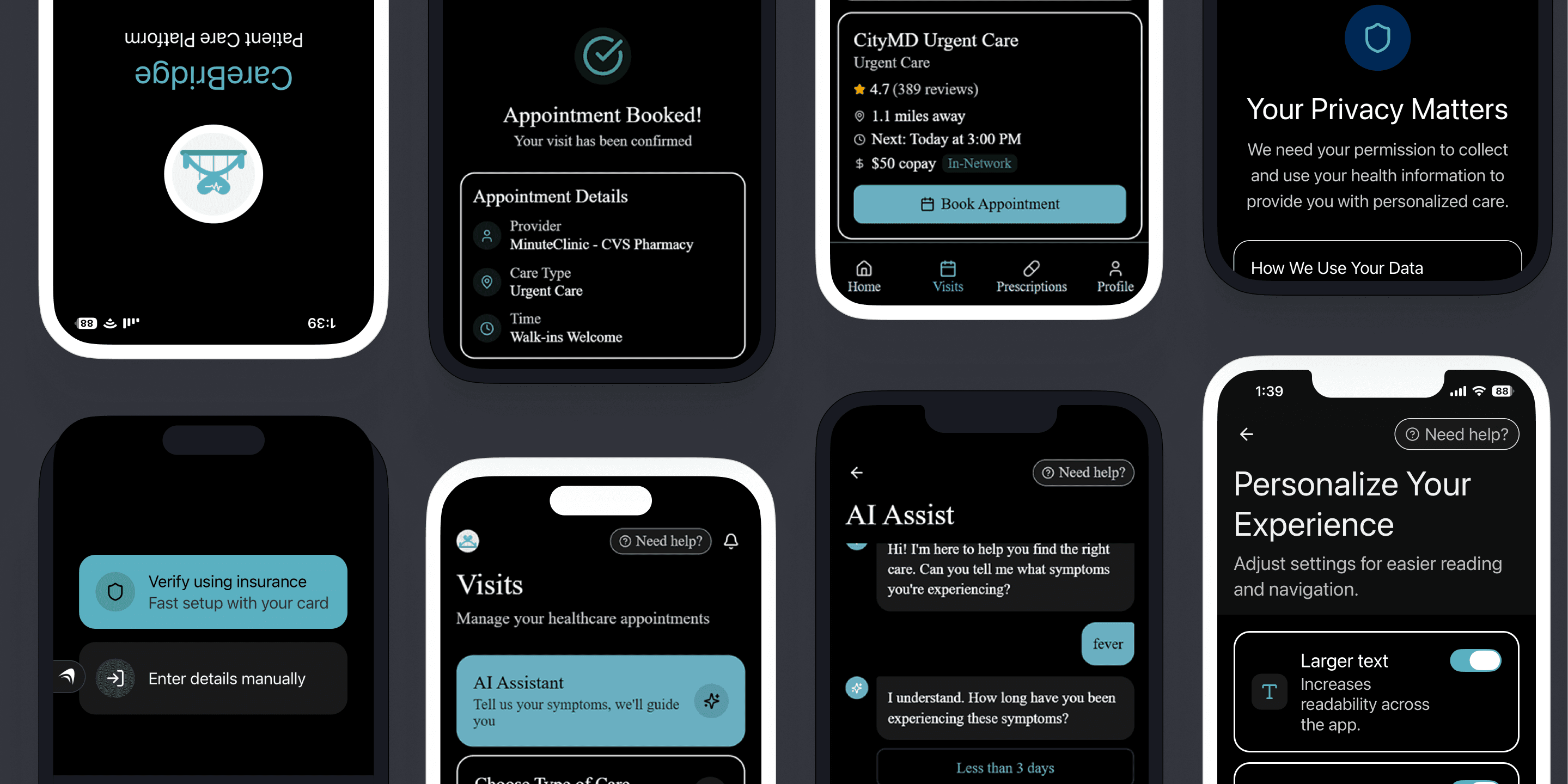
CareBridge is accessibility-first healthcare app designed for the people most healthcare apps forget. For example, the ones who are already sick, fatigued, or overwhelmed when they open it. CareBridge combines AI-assisted appointment booking, plain-language consent, and accessibility personalization from the very first screen.
📋 Problem Statement
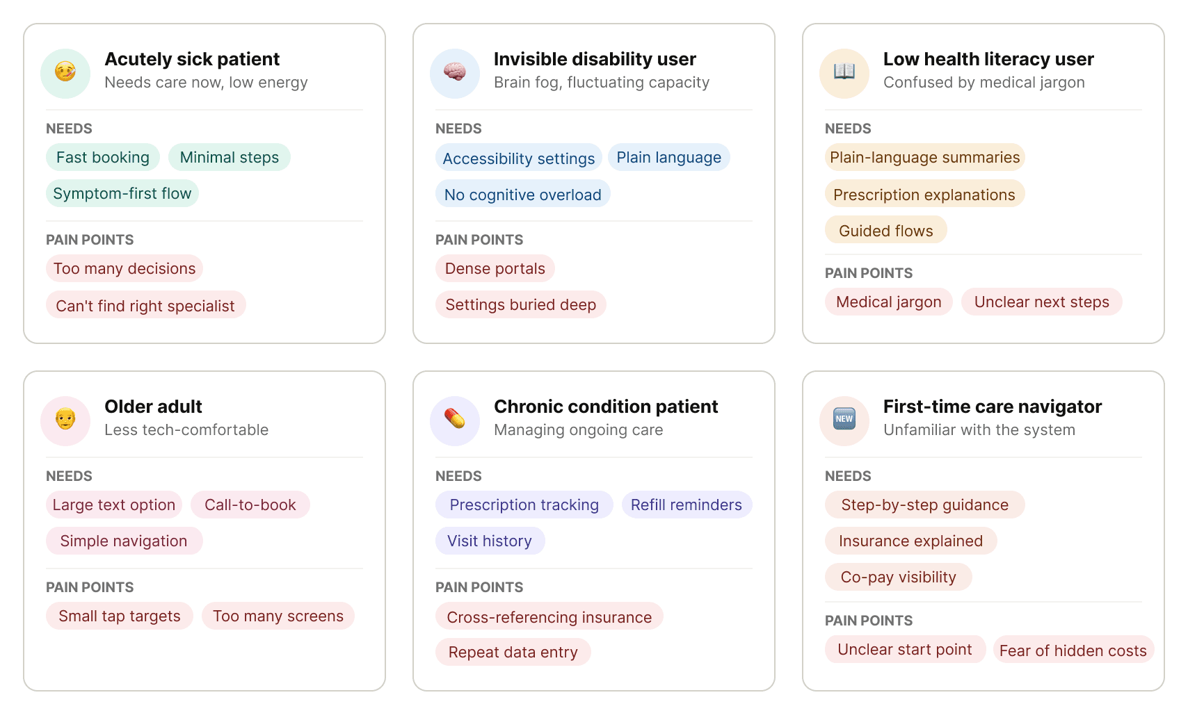
Most healthcare apps aren't built for the people who are the low-tech users, the chronic condition patient, or the person booking a doctor at 11 pm with a three-day fever.
🎯 Goal
Reduce cognitive load for sick, fatigued, and overwhelmed users.
Make accessibility present from onboarding, not buried in settings.
Build trust through transparency: plain-language consent, upfront co-pay visibility, and full user control over their data.
🔎 Research
To understand what people actually experience with healthcare apps, I conducted social listening across Reddit threads and healthcare forums.
Consistent patterns:
Healthcare portals feel overwhelming: Patients described apps as cluttered, hard to navigate, and cognitively exhausting, especially older adults and people managing chronic conditions.
Communication is unclear: Lab results and appointment summaries often appear without explanation. Medical jargon creates anxiety instead of clarity.
Apps assume users are fully healthy and tech-savvy: Many patients using these platforms are dealing with fatigue, pain, brain fog, or stress. The systems don’t account for fluctuating capacity.
There’s no clear path when something doesn’t work: Users experiencing accessibility barriers don’t know where to report issues or who is responsible.
Insurance and pharmacy coordination create friction: Determining coverage, confirming preferred pharmacies, and tracking prescriptions are repetitive and confusing tasks.
📊 Competitive Analysis
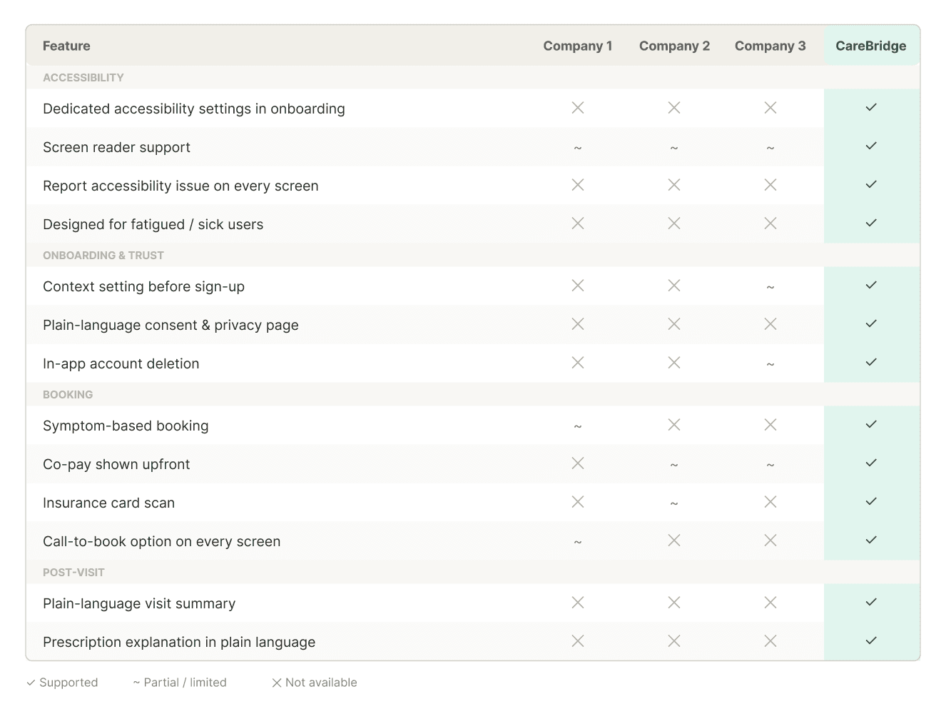
Several key features were either partially implemented or missing entirely across competing platforms. Features that CareBridge made non-negotiable:
Dedicated accessibility settings in onboarding
Screen reader support
Report accessibility issues on every screen
Context setting before sign-up
Plain-language consent and privacy page
In-app account deletion
Symptom-based booking
Co-pay shown upfront
Insurance card scan
Call-to-book option on every screen
Plain-language visit summary
Prescription explanation in plain language
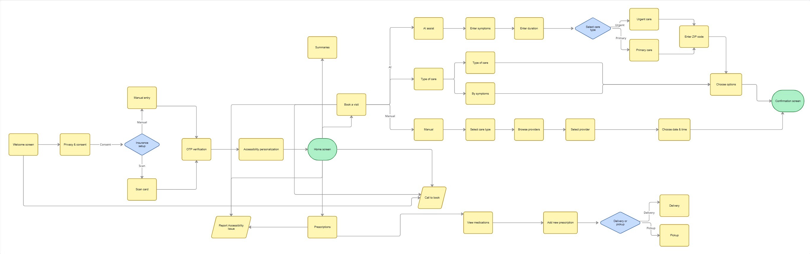
🗺️ User Flow
🧪 Usability Testing
I ran usability testing sessions using a think-aloud protocol with two tasks:
Complete onboarding,
Book an appointment based on your symptoms.
I treated this as an agile sprint where I did a few rounds of interviews, made changes, and tested again.
Round 1
Problem: Participants were confused when the consent screen appeared before they understood what the app was. They were being asked to agree to something before they knew what they were agreeing to.
Fix: Added a welcome screen before consent.
Round 2
Problem: A participant stopped mid-flow and asked what would happen to their data. How could they trust sharing something with AI, and would it even be accurate?
Fix: A dedicated consent and privacy page, written in plain language, explaining exactly how AI data is collected, used, and shared.
Round 3
Problem: There was no way to delete your account from within the app. For a product asking people to hand over sensitive health data, that was a trust gap.
Fix: Adding in-app account deletion was a small change in how safe users felt.
What users loved:
Accessibility personalization right at the start, not hidden in settings.
Easy booking with comfortable, guided choices
AI used to book faster, not to diagnose
In-network status, co-pay, and distance all in one view
Refill reminders
Home delivery option for medications
My learning
Inclusive design: Designing for the person who is sick, fatigued, and overwhelmed makes the experience better for everyone.
Tools: Hands-on experience with vibe coding tools like Anything.com helped me build a working prototype fast.
MoSCoW framework, HIPAA, and GDPR: A working understanding shaped how I think about data, consent, and trust throughout the project.
I came into this project interested in accessibility. I left it convinced that accessibility in healthcare isn’t a niche concern. It’s the whole point.
Future scope
I’d love to explore multi-language support, caregiver access, and integration with health wearables for users managing chronic conditions.
