Paytm Landing Page
Project
Landing Page
Timeline
3 weeks
Role
UX/UI Designer
Company
Paytm

👀Overview
This project was created as a design exercise for the “10K Designers” challenge. Although I was not affiliated with Paytm, the task was to design a landing page for a webinar under the Paytm brand. The aim was to simulate a real-world product design process from insight to delivery and to improve my UX/UI skills, especially in the fintech context.
📋Problem Statement
The goal was to design a landing page for a webinar where visitors would understand the event, see why they should attend, and register. The existing pattern of webinar pages lacked strong motivation, a clear value proposition, and conversion focus.
🎯Goal
Design a landing page that clearly communicates the webinar’s purpose and value to target users.
Create a structure that guides users from awareness → interest → registration.
Emphasize clarity, responsiveness, and trust within a fintech-brand context.
📝Research
Because this was a learning project, research was limited but meaningful. I analysed existing webinar pages and fintech education sites. I also spoke with a few users in the finance/fintech niche to understand motivations and pain-points. I found that users expected tangible takeaways, accessible guest speakers, and interactive formats.
🗣Target Audience
Any Student
A person with no capital but interested in learning and investing
A person interested in Investments
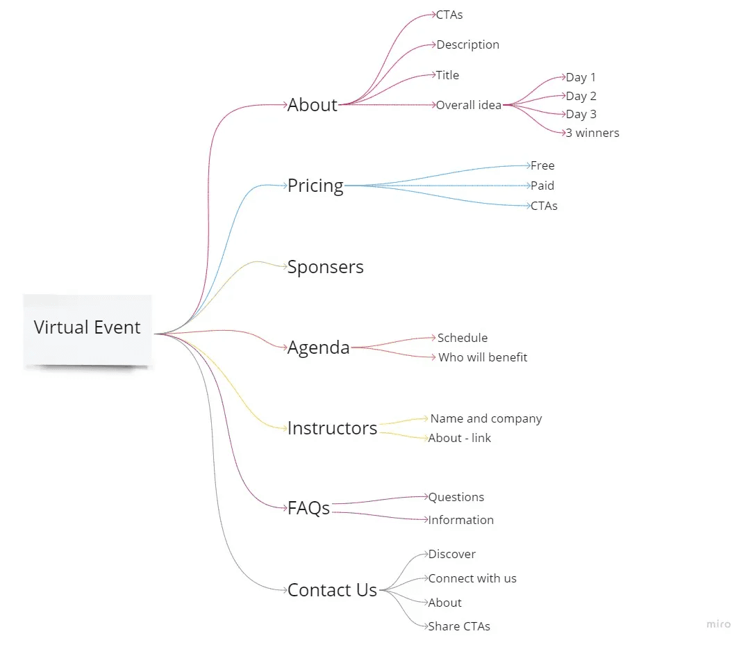
Information Architecture
I listed key content: event details, benefits of attending, schedule, guest speakers, pricing/registration, and FAQ. Then I mapped how these should appear on the page to reduce friction from the hero section to the registration form.
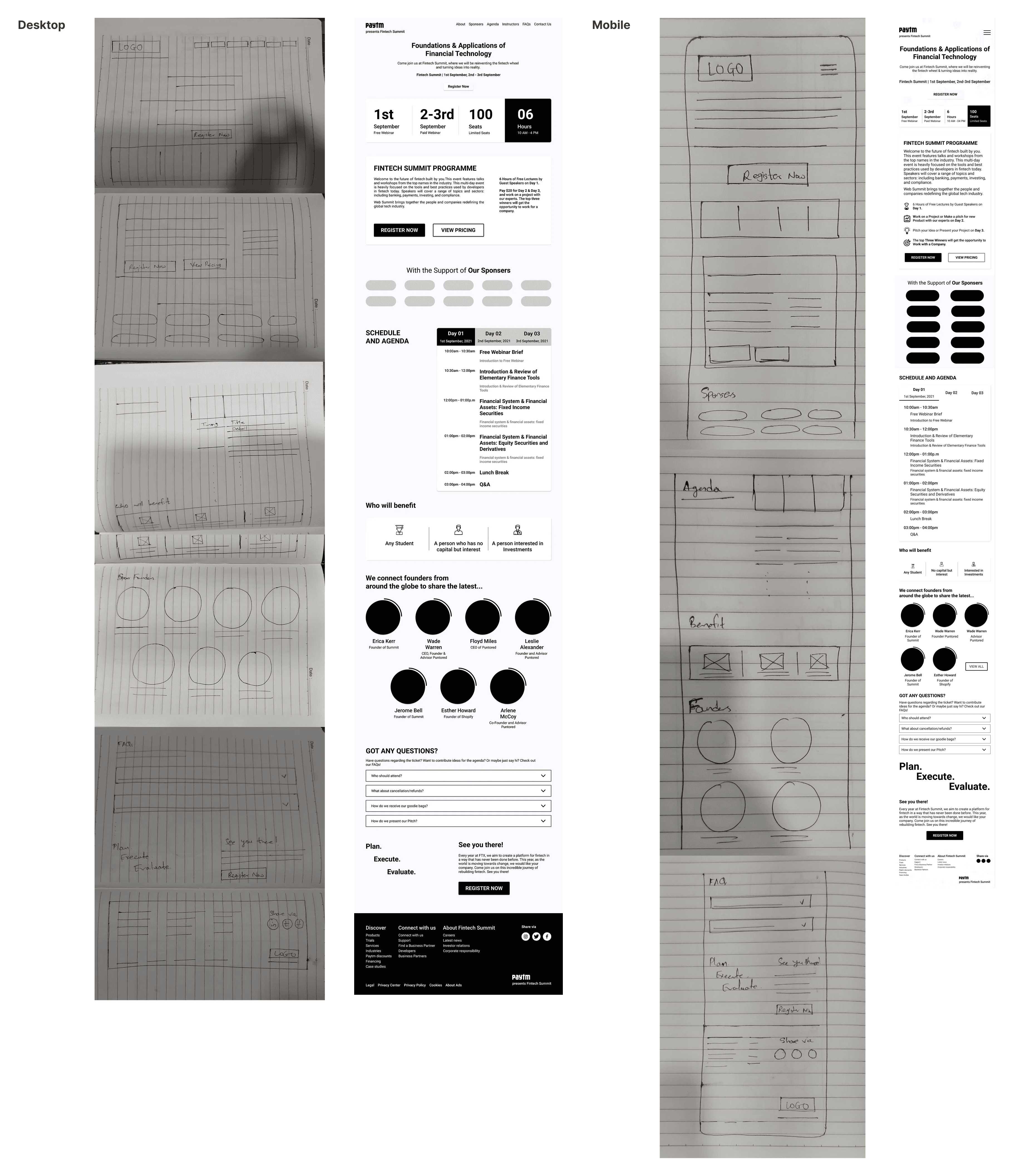
📑Wireframe
I began with pen-and-paper sketches, then created low-fidelity wireframes for desktop and mobile. I moved to high-fidelity mockups in Figma, designing a layout that prioritized the CTA and made registration immediate.
🧐Outcomes
Users were able to identify the value of the webinar within seconds of landing on the page.
Mobile responsiveness and layout changes significantly improved clarity in peer usability tests.
🌱Learnings
Even a short exercise taught me how research + structure + iteration still matter, not just “make it look good”.
Designing for mobile-first in fintech contexts means every interaction must feel trustworthy and immediate.
The value proposition must be clear: users decide quickly whether to register or leave.
Visual credibility (guest speakers, schedule, real outcomes) builds trust, especially in educational/finance domains.
