
In a hurry? Watch a short video of the prototype:
👀Overview
Redesigned the app to support not just alcohol delivery but also mixers, bar tools, and curated recipes for cocktails and mocktails. I mapped out a new flow inspired by grocery apps and created screens for ingredient bundles and drink suggestions. The goal was to turn alcohol delivery into a fun, all-in-one experience.
📋Problem Statement
Many users who want to order drinks currently switch between multiple apps or websites, one for groceries, one for alcohol, and one for bar accessories. This fragmentation creates friction and wasted time. The app aimed to unify this experience under one roof, making it easier and more satisfying for users.
🎯Goal
Design a mobile shopping experience that lets users discover drinks, related accessories, and even gift options seamlessly.
Improve browsing efficiency, helping users find what they need in fewer taps.
🤭Storytime!
Being in your early 20s is all about exploring, socializing, and trying new experiences. But during lockdown, opportunities to go out and connect were limited.
One day, while ordering pasta 🍝, I wanted the perfect drink to go with it. Since I’m not a huge fan of soda, I looked up what pairs well with pasta and discovered that wine was the ideal match.
I pulled out my phone to find a delivery app that could bring both drinks and related items. Every app I found either focused solely on alcohol delivery or on grocery and party supplies. Curious to see if others faced the same issue, I reached out to friends and fellow foodies, and I wasn’t alone! Many were looking for a single app that could handle all their beverage and accessory needs.
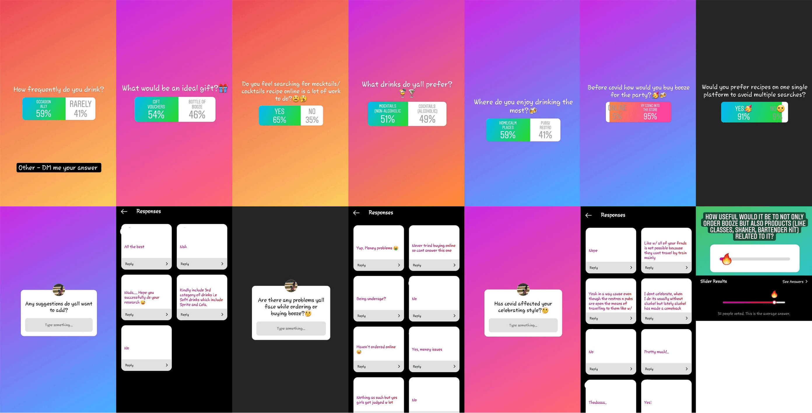
🔎Research
To validate the idea, I conducted an Instagram poll. Because this was during/after COVID, many users had shifted to online ordering and wanted everything in one app.
Key Insights (India-specific & Global)
Cultural sensitivity: Many women felt judged buying alcohol in stores; delivery felt safer and more private.
Mixology gap: Users wanted bar-like experiences at home but lacked tools, ingredients, and guidance.
Convenience matters: Younger users disliked juggling multiple apps.
Quantitative and Qualitative Analysis
I tried to reach out to as many younger generations as I could via “Instagram Poll”

Instagram Poll
All user data shared in this case study was collected with full consent from participants. I received permission from all respondents to use their feedback and insights for this project.
Qualitative Data:
91% preferred ordering food + drinks from the same app
59% wanted drinks + party supplies in one place
40% of women avoid in-store alcohol due to stigma
65% would use a cocktail recipe feature
Quantitative Data:
Users wanted a complete experience: drinks + ingredients + tools
Gifting should allow vouchers rather than just choosing a bottle
Recipes increase engagement
Users want non-alcoholic options too
User Personas
User 1

User 2

An interesting tip from the users: People prefer to give a gift voucher that allows another user to purchase their favorite beverage.
Types of Users

Key Features
To address the needs identified in my research, I designed a set of key features that would create a seamless, comprehensive experience for users looking to order drinks and related products:
🍹 Recipe Section: Users can follow these recipes to make popular drinks at home, catering to those who want to enjoy the bar experience without leaving their space.
🍸 Bar Essentials: Beyond beverages, users can order bar-related materials, like glasses, mixing spoons, and cocktail shakers.
🎁 Gifting Options: Users can either select gift recommendations, such as a bottle of wine, or present a Gift Voucher, which allows recipients to choose their preferred drinks or bar essentials.
🥤 Soft Drinks: For users who prefer non-alcoholic options, soft drinks are also available, making the app versatile for all types of users and occasions.
📊Sitemap and IA

This stage helped me to clearly define and represent how the user will navigate through the app and the information/metadata to be displayed on the screens.
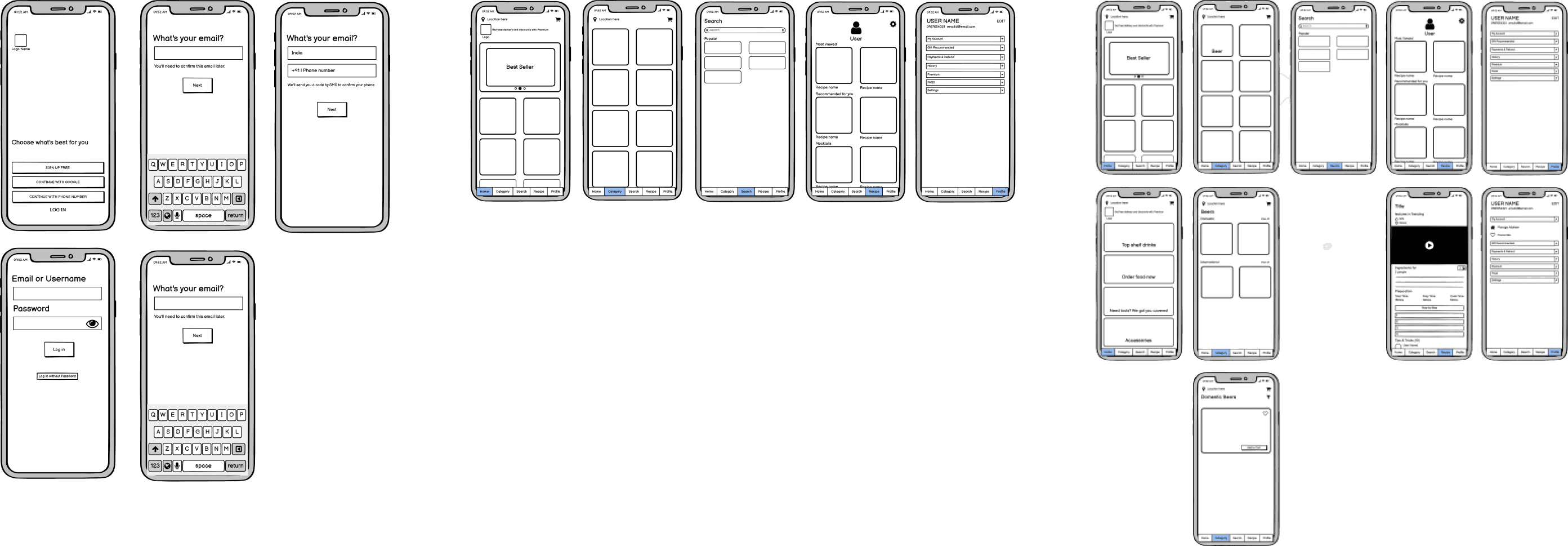
📑Wireframe
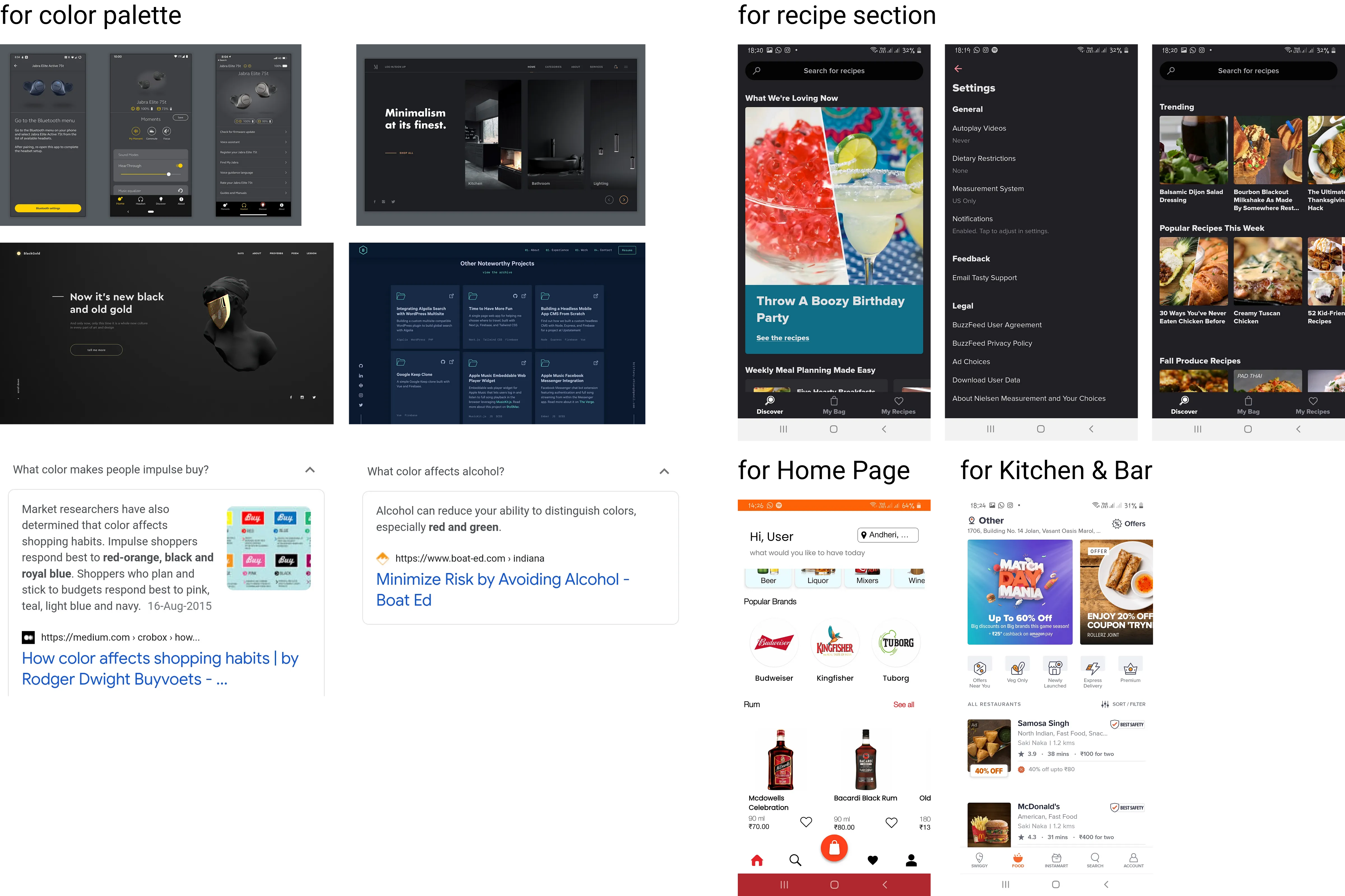
I conducted color psychology research to identify which colors are most appealing to users. To select the right color palette for my visual design, I also considered colors that might irritate or discomfort users, especially after they’ve had a few drinks. This research guided my choice of a color palette that enhances the overall user experience.
💡Moodboard
📒Style Guide

🎨Visual Design


🧐Outcome
Although this is a conceptual project, informal prototype walkthroughs revealed:
Users easily understood the app flow and core features
Recipes was a favorite feature
The idea of combining drinks + tools + soft drinks + recipes was highly valued
The color palette felt comfortable and non-straining
Future scope: expanding flows for food ordering and kitchen + bar bundles.
🌱Learnings
Empathy shapes meaningful features, especially around culture and stigma.
Strong IA and early user flows keep navigation intuitive.
Prototype testing, even informally, reveals actionable insights quickly.
Thoughtful visuals and context-aware color choices improve usability and comfort.
I want to thank Abhinav Chikkara for coming up with this assignment and giving me feedback.
Special thanks to Aboli Joshi for the constant feedback on this assignment.
