
In a hurry? Watch a short video of the prototype:
👀Overview
Conceptualized and designed a feature that allows users to filter meals by dietary preferences (e.g., vegan, gluten-free). I led the research and then translated insights into wireframes that promoted inclusivity and faster decision-making. The solution was designed to fit seamlessly into DoorDash’s existing flow.
📋Problem Statement
While DoorDash offers a variety of food options, users with dietary restrictions often find it challenging to identify meals that meet their needs. This lack of personalization can lead to frustration and reduced customer retention.
🎯Goal
The goal was to design and implement a feature on DoorDash that would enable users to filter meals based on dietary restrictions, such as allergies or fitness goals. This feature would simplify meal selection for health-conscious users and those with dietary needs.
🤭Storytime!
This project began during a late-night hackathon. My friends and I were starving, and ordering food felt like the quickest solution…until it wasn’t. A few of them had dietary restrictions, and what should have been a simple task turned into endless scrolling, second-guessing ingredients, and frustration.
After almost giving up, they chose to order groceries instead because they couldn’t trust the options shown. That moment stuck with me. Access to safe food shouldn’t be that hard!
🔎User Research (Part 1)
User Persona
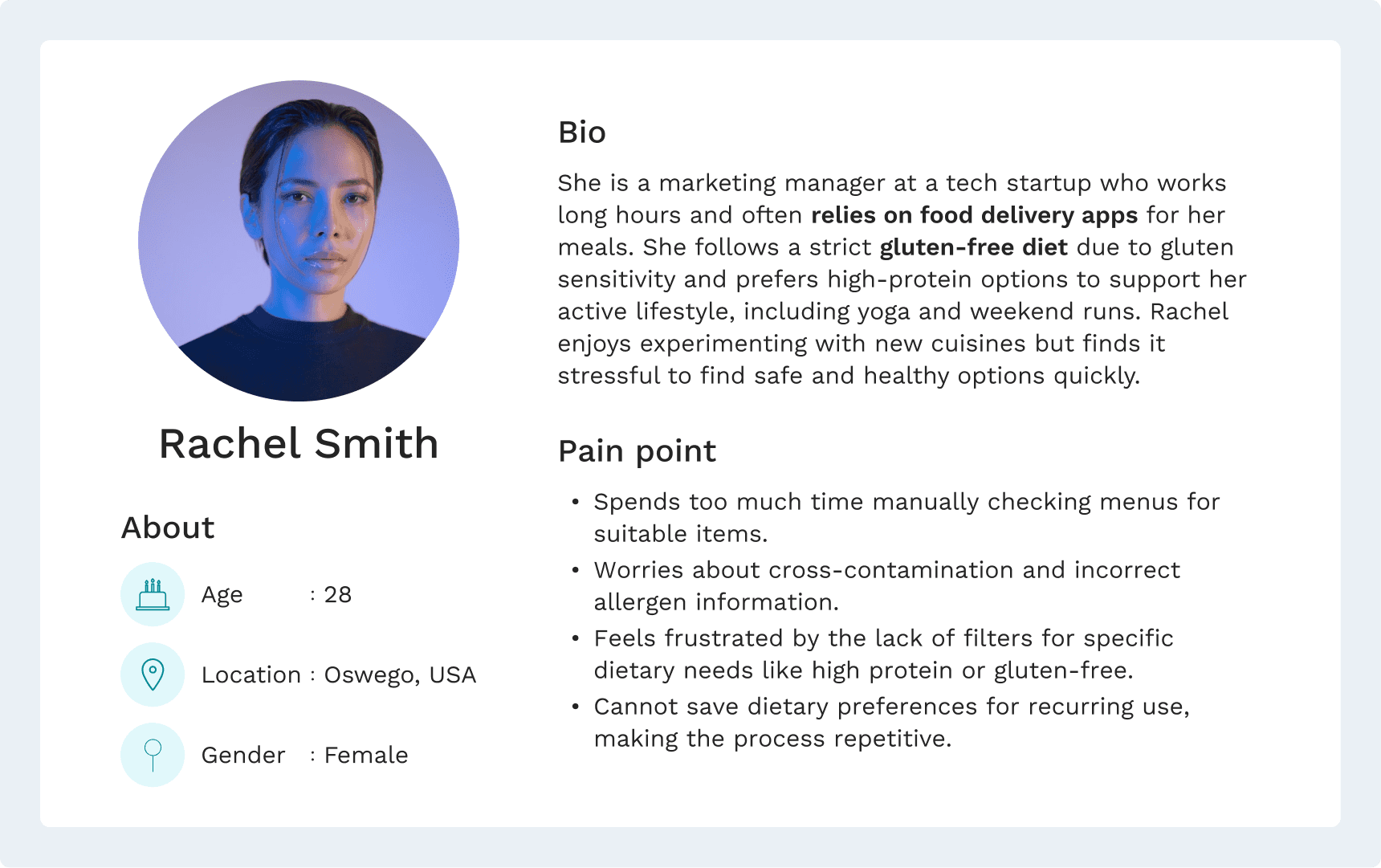
Pain Points
Conducted one-on-one interviews with fitness enthusiasts and users with medical dietary needs to gain qualitative insights. Here’s what I found out:

📑Wireframe
🎨Visuals
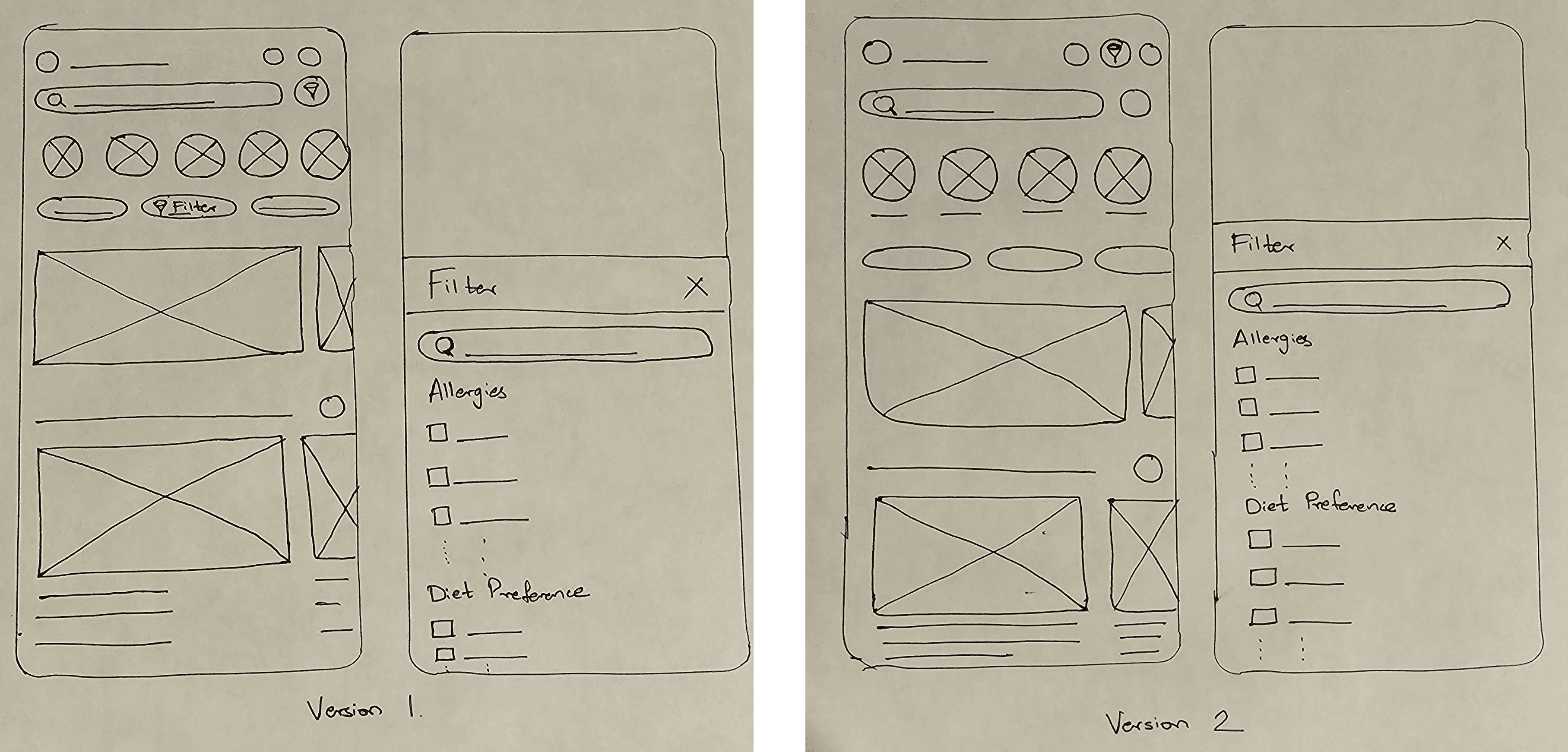
The research had two design versions for filtering dietary preferences:
Design 1:
Design 1 (Fig. 1) featured two filter options on the home page to enhance accessibility and discoverability. One filter was prominently placed next to the search bar for quick access, improving proximity and reducing decision-making effort, aligning with Hick’s Law. The second option was integrated within predefined filters on DoorDash, adhering to Jakob’s Law, which leverages users’ familiarity with common design patterns for ease of use.

Design 2:
Design 2 (Fig. 2) had a single, strategically placed filter option between the notifications and cart icons. This design choice was made based on Fitts’ Law, ensuring the filter was positioned within easy reach to minimize navigation effort and optimize user efficiency.

Both designs aimed to make the interface user-friendly, reducing cognitive load and guiding users toward efficient task completion.
🔎User Research (Part 2)
To understand the challenges faced by users with dietary restrictions and validate potential solutions, I conducted extensive user research using qualitative and quantitative methods. The research process involved three questionnaires: a pre-test and two post-tests.
After designing the dietary filter feature, I created interactive prototypes using Figma. Participants were tasked to use these prototypes to simulate real-world scenarios, such as finding a gluten-free meal.
A pre-test questionnaire was conducted to gather data on users’ behaviors, preferences, and challenges when navigating dietary options on food delivery platforms. After introducing the new design, post-test questionnaires were used to evaluate key metrics, including task completion time, ease of use, and user confidence in the system.
Quantitative Analysis:
Completion of time:-

Users finished tasks faster with Design 1 compared to Design 2, which made meal selection quicker and less frustrating.
Ease of use:-
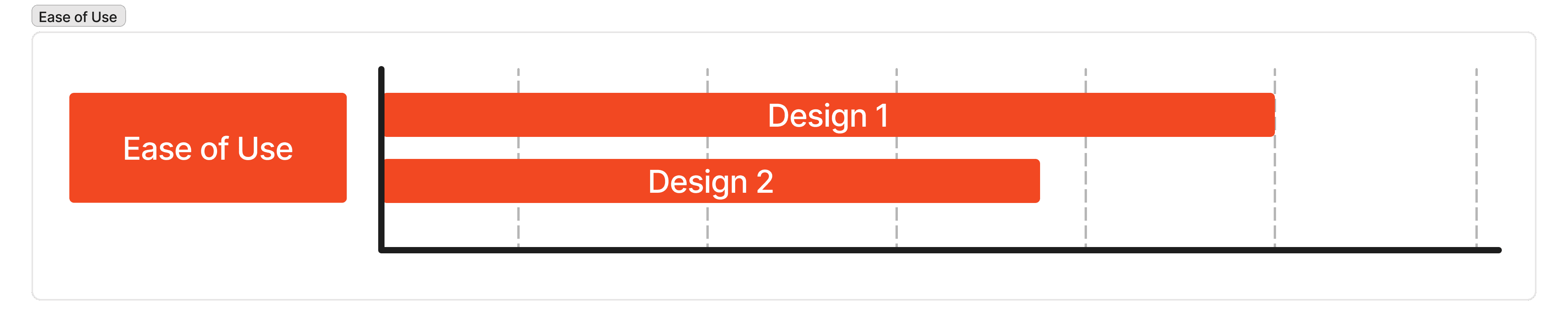
Users found Design 1 easier to use than Design 2, helping them navigate the options more smoothly.
Confidence:-

Users felt equally confident using both designs, showing that both supported decision-making well.
Qualitative Analysis:
Preference for filter option: Most participants preferred the filter option in Design 1, finding it intuitive and helpful in completing their tasks efficiently.
Experiencing difficulties in completing the tasks: Most participants reported minimal to no difficulties completing the assigned tasks in Design 1, especially, which means the design supports seamless interaction.
Intended design flow: In Design 1, participants could navigate through the intended flow design without confusion, suggesting that the layout and structure align well with user expectations.
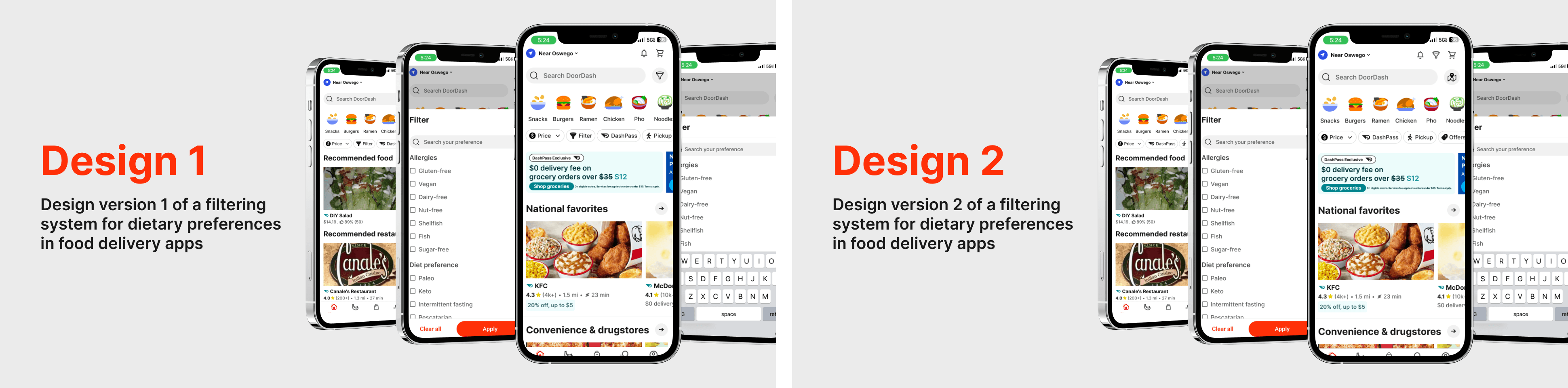
🎨Final Visuals

🧐Outcomes
Quantitative Analysis
Task Completion Time: Participants using Design 1 completed their tasks faster than Design 2, with an average task completion time of 1 minute for Design 1.
Confidence Score: On a scale of 1 to 5, Design 1 received an average score of 4.
Ease of Use: On a scale of 1 to 5, Design 1 received an average score of 4. The key factors included clarity, ease of navigation, and reduced cognitive load.
Qualitative Analysis
Users mentioned the visual hierarchy in Design 1 made critical information more accessible.
Users displayed fewer errors and required less guidance while interacting with Design 1.
🌱Learnings
Learned that even small design decisions can make someone’s life better. Adding dietary filters made the experience truly inclusive.
Realized how placing filters upfront can make choices faster and reduce frustration.
Discovered that balancing innovation with familiar patterns builds trust and improves usability.
Practiced agile iteration by testing two designs and refining ideas based on real feedback.
Strengthened my ability to turn research insights into meaningful, measurable design improvements.
