How I Made Online Shopping a Seamless Experience

How I Made Online Shopping a Seamless Experience

How I Made Online Shopping a Seamless Experience

The image features a Skillmatics website showcasing their landing and product page for Desktop and mobile.

Project

Website Redesign

Website Redesign

Website Redesign

Timeline

1 year 4 months

1 year 4 months

1 year 4 months

Company

Skillmatics

Skillmatics

Skillmatics

Tools

Figma, Shopify, PageFly, Lucky Orange, Google Analytics, Klaviyo, & WebAIM

Figma, Shopify, PageFly, Lucky Orange, Google Analytics, Klaviyo, & WebAIM

Figma, Shopify, PageFly, Lucky Orange, Google Analytics, Klaviyo, & WebAIM

Role

UX/UI Designer, Researcher, QA Specialist, Email Designer, Shopify & No-Code Front-End Developer

UX/UI Designer, Researcher, QA Specialist, Email Designer, Shopify & No-Code Front-End Developer

UX/UI Designer, Researcher, QA Specialist, Email Designer, Shopify & No-Code Front-End Developer

In a hurry? Watch a short video of the prototype:

👀Overview

Skillmatics is an edtech brand known for its award-winning learning games. I joined as a full-time UI/UX Designer, and like most startup stories, my role quickly expanded beyond design. It became my first real 0→1 experience and the place where I learned how design, development, marketing, and analytics come together to shape a product.

I collaborated daily with developers, marketing, product, and analytics, supporting fast weekly releases while owning multiple parts of the digital experience.

📋Problem Statement

The U.S. website struggled to deliver a user-friendly experience for parents and grandparents who were the primary buyers. Navigation wasn’t intuitive, key information was buried, and the overall layout didn’t match user expectations, leading to high bounce rates and low conversions.

🎯Goal

  • Support the shift from subscription to a D2C shopping model

  • Improve navigation and make product discovery faster and more intuitive

  • Reduce bounce rate and increase overall conversions

  • Strengthen trust and clarity for parents and gift-givers browsing the site
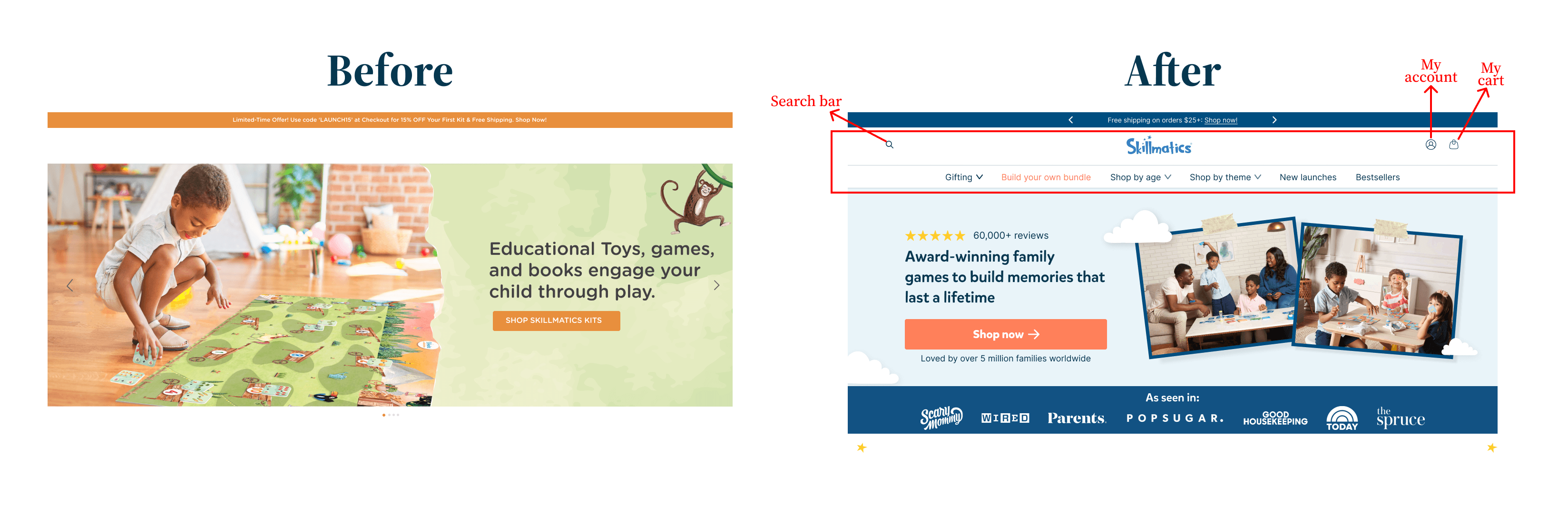
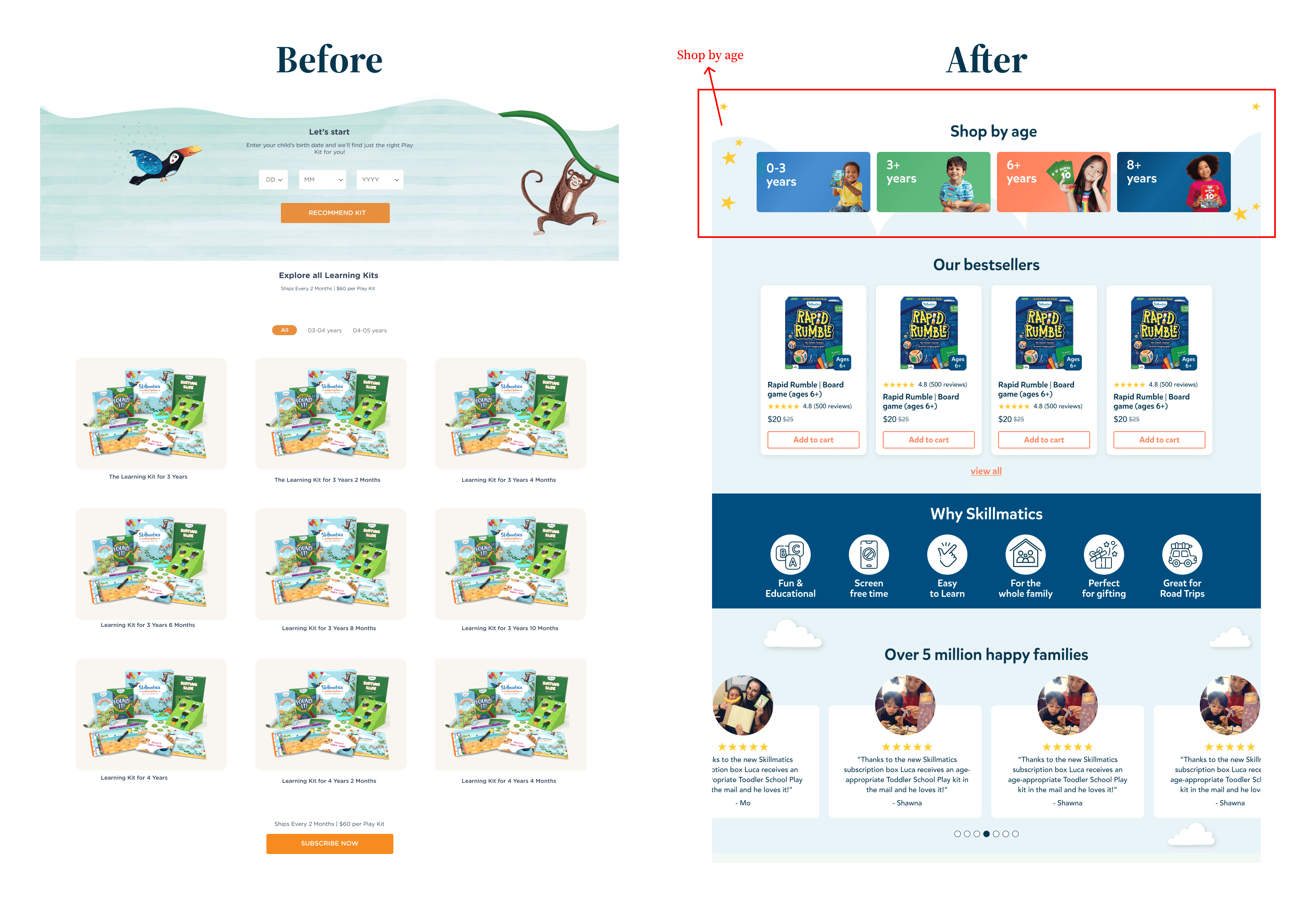
🖥️Before vs After

  • Added a clear global navigation with Search, Account, Cart, Shop by Age, and Shop by Theme

  • Included high-intent links like Bestsellers, New Launches, Gifting, and Build Your Own Bundle

  • Replaced the low-engagement age calculator with a straightforward Shop by Age section

  • Opened space for bestsellers, testimonials, value props, and trust-building elements

Features "Before" vs "After" of the homepage part 1Features "Before" vs "After" of the homepage part 2

🔎Research

To understand user behavior, I conducted informal testing with colleagues and reviewed customer feedback. I paired this with heatmap analysis via Lucky Orange and competitive research on other brands.

Across all sources, the patterns were clear:

  • Parents prefer shopping by age

  • Familiar e-commerce patterns build trust

  • Users scroll less when the content hierarchy is strong

  • Product benefits and social proof must appear earlier

User Persona
Image version patterns mentioned above
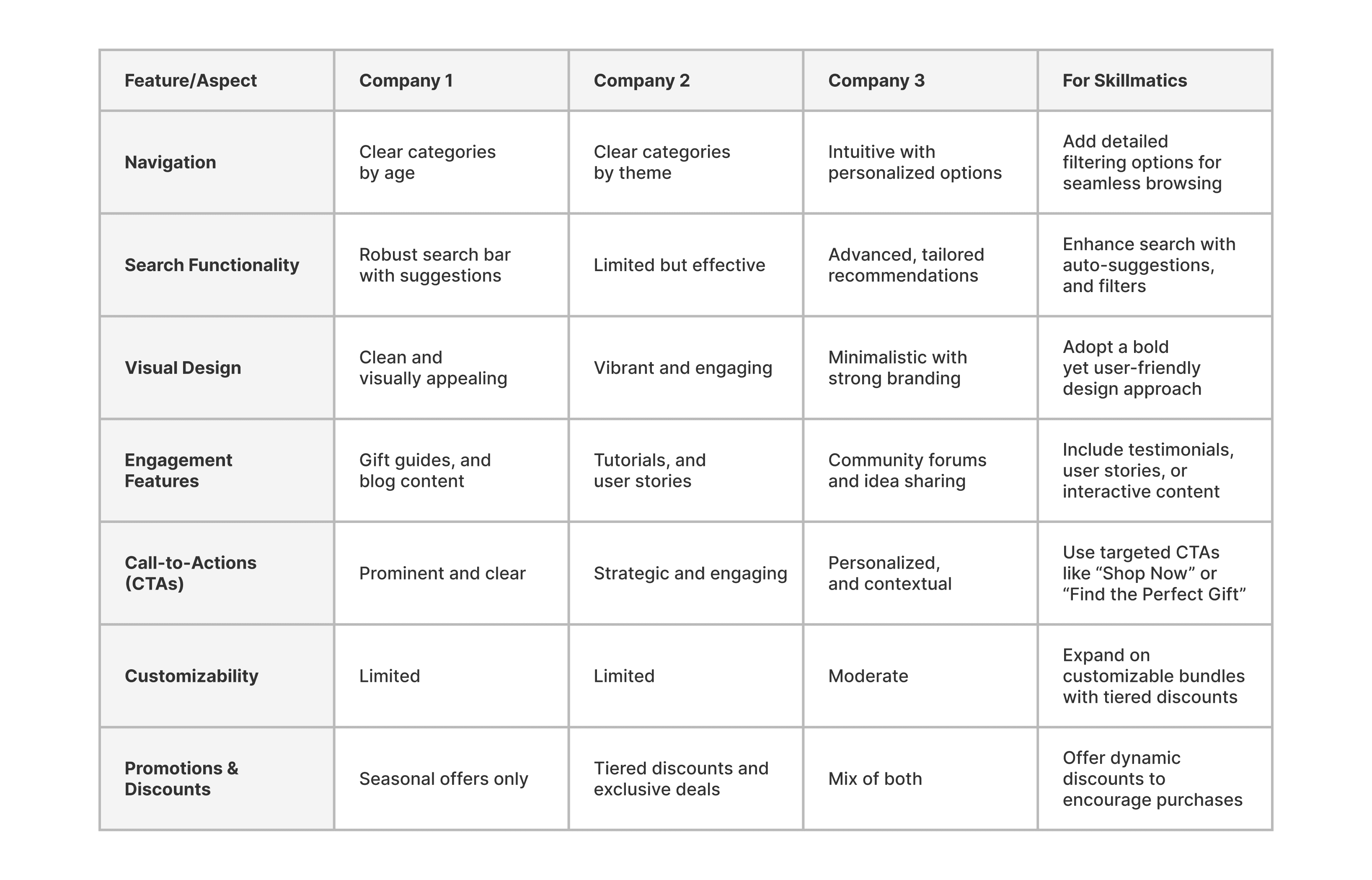
Competitive Analysis
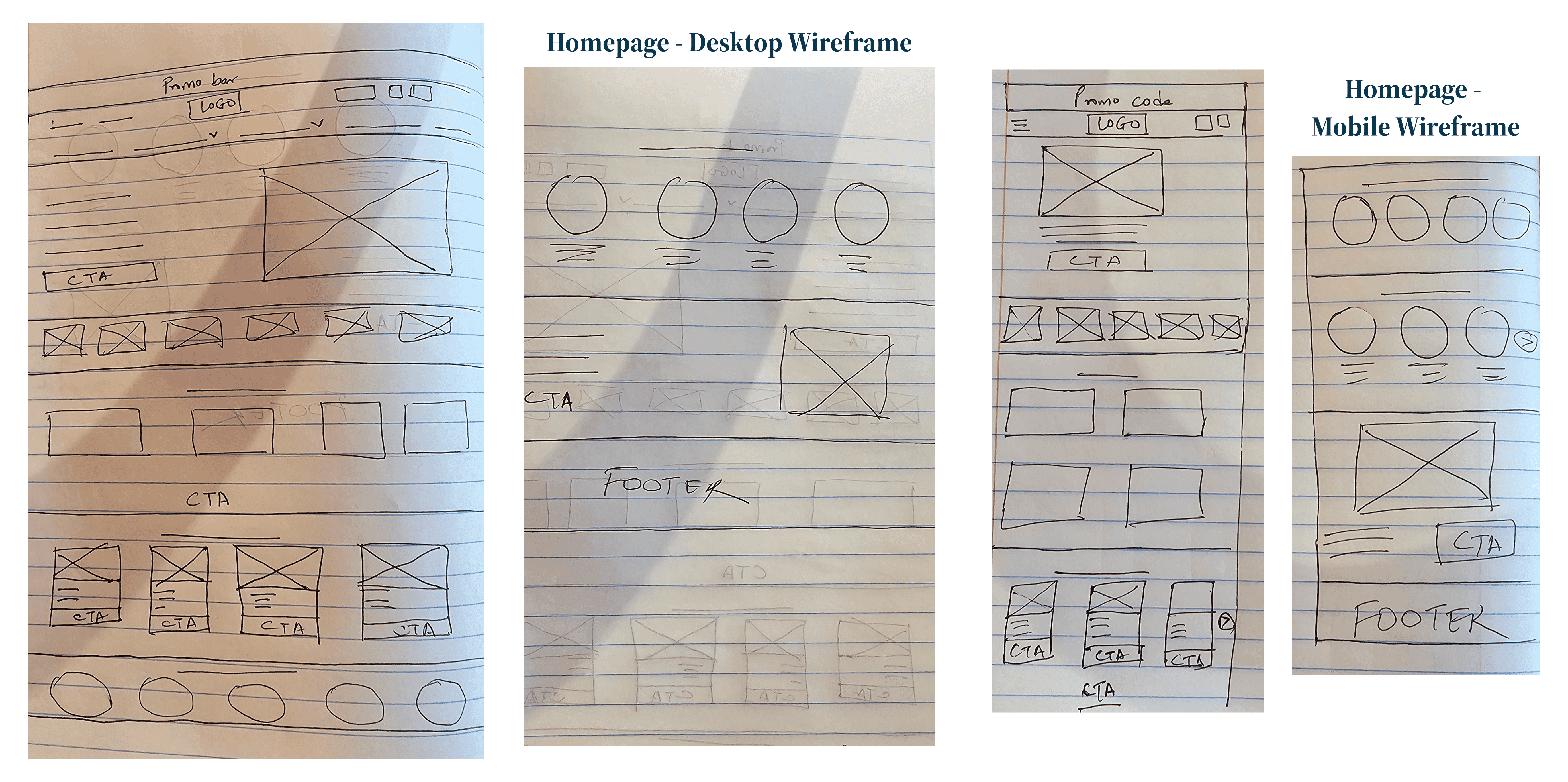
Competitive analysis matrix comparing e-commerce experience of three benchmark companies with Skillmatics improvement opportunities across navigation, search functionality, visual design, engagement features, call-to-actions, customizability, and discount strategy.

📑Wireframe

Once insights were gathered, I created low-fidelity wireframes to establish structure and key functionalities. This aligned with familiar e-commerce mental models and simplified how users explored the catalog.

alt=""

💡Moodboard

A collage of various website designs showing different layout styles, product grids, hero banners, and mobile-friendly interfaces.

📒Style Guide

Two design guidelines displayed side by side: the left panel shows typography standards for desktop and mobile, featuring font sizes and styles; the right panel illustrates padding rules using multiples of 48, with a visual example of sectional spacing.
The image displays a color palette with primary, secondary, and tertiary colors alongside various background textures featuring patterns like clouds, stars, and abstract shapes.
A design system layout featuring sections for mobile and desktop buttons, icons, illustrations, logos, and user interface components, emphasizing UI/UX design resources.

🎨Visuals

Mobile version of the website design, including menu design, homepage layout, and various product and collection pages, highlighting user-friendly navigation and organized product displays.
Desktop version of the website design, including menu design, homepage layout, and various product and collection pages, highlighting user-friendly navigation and organized product displays.

📦Build Your Own Bundle (BYOB):

The team initially offered pre-made bundles for sale. However, through qualitative analysis, I discovered that customers preferred the flexibility to mix and match products based on their preferences. This insight revealed an opportunity to improve user satisfaction and better meet customer expectations.

  • The concept was straightforward: customers could choose the products they wanted and receive discounts based on the number of items selected.

  • The tiered discount structure offered a minimum of 15% and a maximum of 25% off, encouraging higher cart values. This approach balanced customer empowerment with business goals, making the shopping experience both satisfying and rewarding.

  • The BYOB feature gave users the freedom to mix and match products, fostering a sense of value and personalization.

Mockup of BYOB landing page

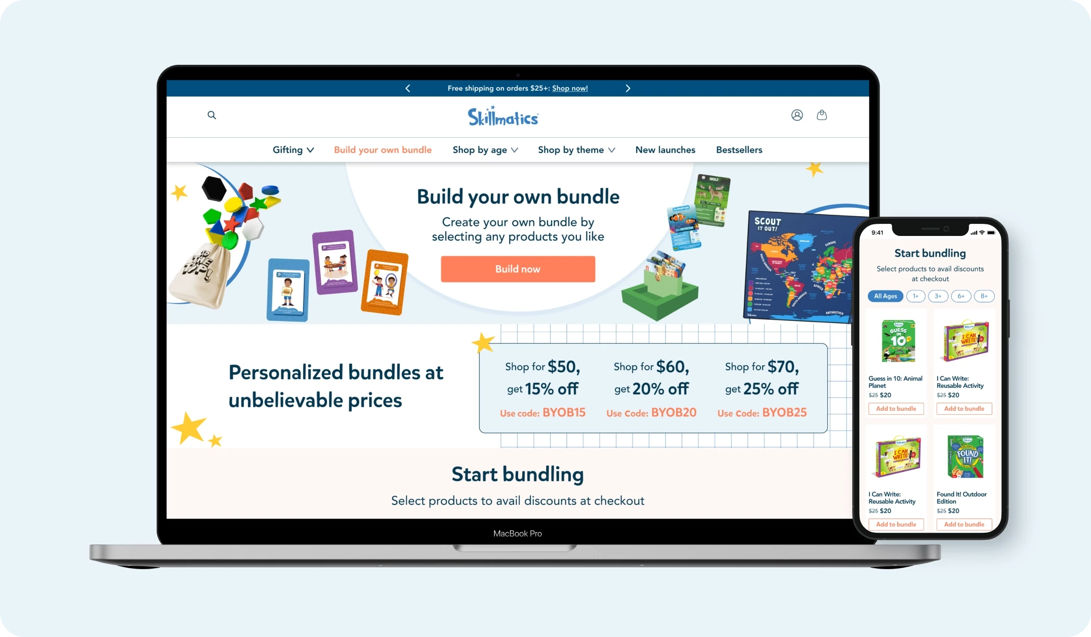
This feature boosted company profits by 10%, and positive feedback from customers about the enhanced shopping experience was received.

🚀 Outcomes

  • 30% better readability by simplifying visuals, improving contrast, and aligning icon styles with familiar mental models.

  • 10% organic increase in profits from BYOB through tiered discounts and an intuitive mix-and-match flow that encouraged larger carts.

  • Faster product discovery for families by restructuring navigation and introducing “Shop by Age” and “Shop by Theme.”

  • Reduced checkout drop-offs by surfacing trust elements such as testimonials, value strips, and clearer product details.

  • Less developer rework thanks to stronger QA, reusable components, and early alignment across design, marketing, and engineering.

🎨Final Visuals

Mobile version of a variety of layouts
Desktop version of a variety of layouts

🌱Challenges & Learnings

Challenges

Working in a fast-growing startup meant constant iteration, tight timelines, and balancing competing priorities. Marketing often needed quick launches, while Analytics wanted to test multiple versions of the same design. PageFly’s layout constraints required creative workarounds, and customized code risked slowing page speed. Managing QA and frequent Shopify updates made coordination essential to keep releases smooth and consistent.

Learnings

These challenges taught me how to communicate clearly across teams, stay flexible when priorities shifted, and anchor decisions in real user needs. I learned the value of usability testing, QA, and analytics in shaping solutions, and became confident using Shopify, Lucky Orange, and PageFly to solve real problems. It reinforced how thoughtful iteration and cross-functional collaboration lead to stronger outcomes.